Many of the talks and papers I see on data visualisation start by saying something about how we’re generating and storing more data than we can process. The solution they present is, of course, data visualisation.
Many of the talks and papers I see on data visualisation start by saying something about how we’re generating and storing more data than we can process. The solution they present is, of course, data visualisation.
Data visualisation is definitely a tool for our times, which is great! We now have pre-digested information, complex scientific reports translated into pretty colours and a million different ways of looking at twitter.
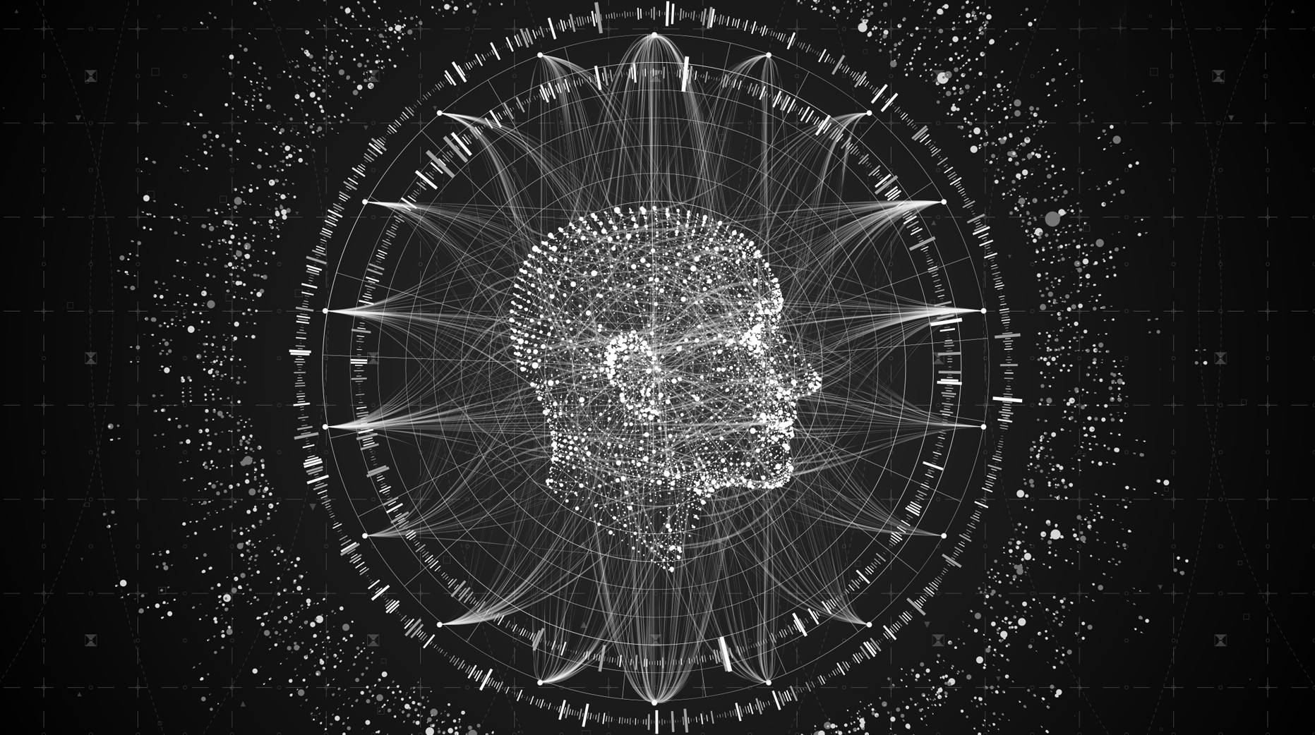
But where did it come from? Data visualisation, or information visualisation, isn’t anything new – even interaction isn’t that new either. An early example of an information visualisation could be the thermometer, or a barometer.
These use a reactive form of interaction to convert data (the current temperature, for example) into something that is easily understood by a general audience. The difference now, compared to the 16th century, is that we have so many more data sources. If you have important information now, it seems you need to visualise it.
So how should we go about disseminating important research? I would suggest art. I’ll draw a line here between art and design, just for the sake of making my point clearer. Scientists approach visualisation as educating people, showing relationships between facts, even using visualisation as a tool in the scientific process.
Designers take these facts, without losing any resolution, and digest the information – which can be difficult to do at times – so that you and I can make sense of it. Artists differ from designers.
Firstly they use a different set of tools. For example artists often use abstract representation, where designers use literal comparison. Designers educate their audience on a topic, where artists make them feel something about the facts they are being shown.
The way art is able to tap into our emotions is what I’m using to differentiate between artists and designers here, of course a designer can make an emotive visualisation, or an artwork, but it’s where we’re drawing a line between the art approach and the design approach. The reason there is a difference between the two approaches is because of the way our brains function.
One interesting thing about the brain is that it not only remembers facts, it remembers feelings about facts. By creating an emotional connection to information artists can influence the decisions people make, based on what they learned from an artwork.
Of course you don’t have to make emotional links with data to make good visualisation – an excellent example of information visualisation from the 1930’s is the Tube Map (London’s underground rail network), which reduces information so only what’s relevant is shown. You don’t need an emotional link, just to know how to get to your destination.
But think about important research into environmental sustainability, or climate change. Scientists are telling us that we need to change our habits, but will this translate into action by the general population?
If we use a designed approach, presenting information beautifully, but without making the user care, how will they change their routine? Scientists and artists working together to communicate the intent of new scientific research have the opportunity to change facts into action.


These Stories on Performance

I'm a designer and PhD candidate with CSIRO and the Design Lab at Sydney Uni. I'm comparing different types of visualisations.
Monday to Friday
9:00am - 5:00pm (AEST)
Sydney, Australia
We reply within 48 hours!
General Business Enquiries:
hello@aboutmybrain.com
Technical Support:
support@aboutmybrain.com

No Comments Yet
Let us know what you think